Wow. This is really the official logo that London came up with for the 2012 Summer Olympic Games:
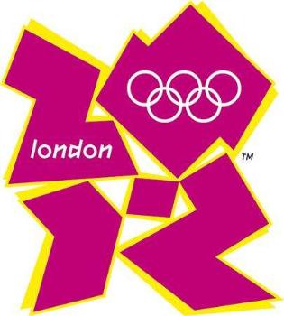
And it only cost them about $800,000 to design.
Holy crap.
The jagged shapes are supposed to look like the numbers "2012" somehow. Frankly, as many have pointed out, they look, well, um, like something else entirely.
The BBC has been soliciting readers to come up with something better. My favorite so far, submitted by a gentleman named Paul Day:
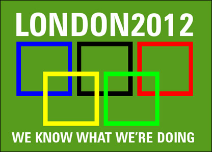
Frankly, he deserves the $800,000 a heck of a lot more.
Blogging will be sparse for a few days. Busy.
UPDATE: Turns out one of the animations used at the unveiling also caused epileptic seizures.